Even though an icon is a very small image, it’s impossible to overestimate its importance: it should be accurate in metaphors and readable so that only by the first look one can understand the meaning /service /concept. And if an icon is used on your homepage or mobile app, it is also a part of your corporate identity. That’s why the creation of icon families takes time and effort. Here is the story of Liconica – a quite small but significant for our studio family of icons.
Liconica’s history goes back to November 2015.
It all started with two sets on the theme of “Office” and had been making it for a month, checking and testing the style.

We had been working on the style a lot, having decided at once that the icons should have been colorful with the outline. We had been choosing stroke thickness and color scheme.
At the beginning there were three color schemes: blue, blue-red, and blue green. But then we stuck to one, having understood that it emphasizes the style best.
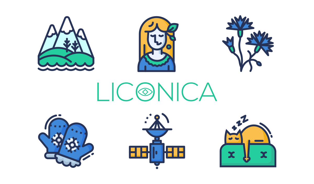
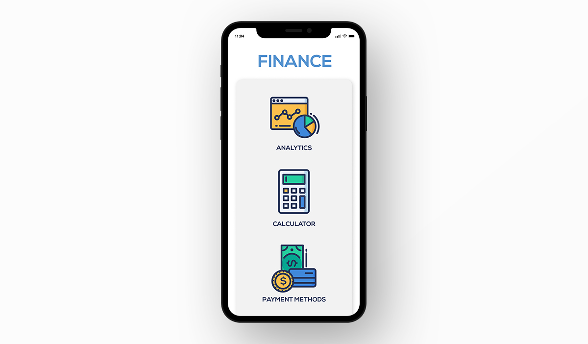
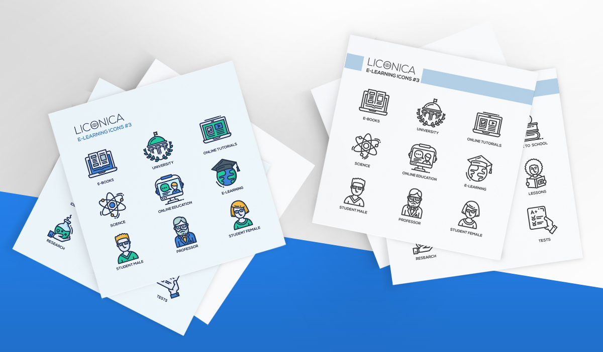
Eventually, the starter set included 108 icons that contained the themes: office, business, and online education.

When we created the starting set and noticed that customers like it, we decided to develop the collection. We added some non-business themes:
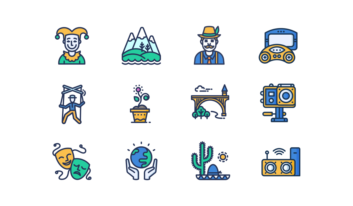
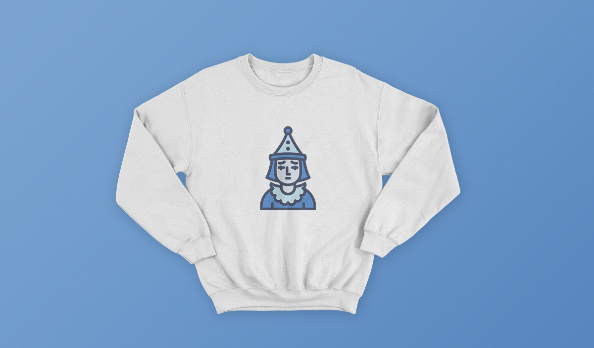
- theater and cinema;
- ecology, nature & seasons;
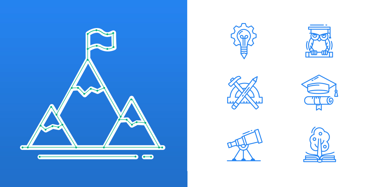
- traveling, countries and landmarks;
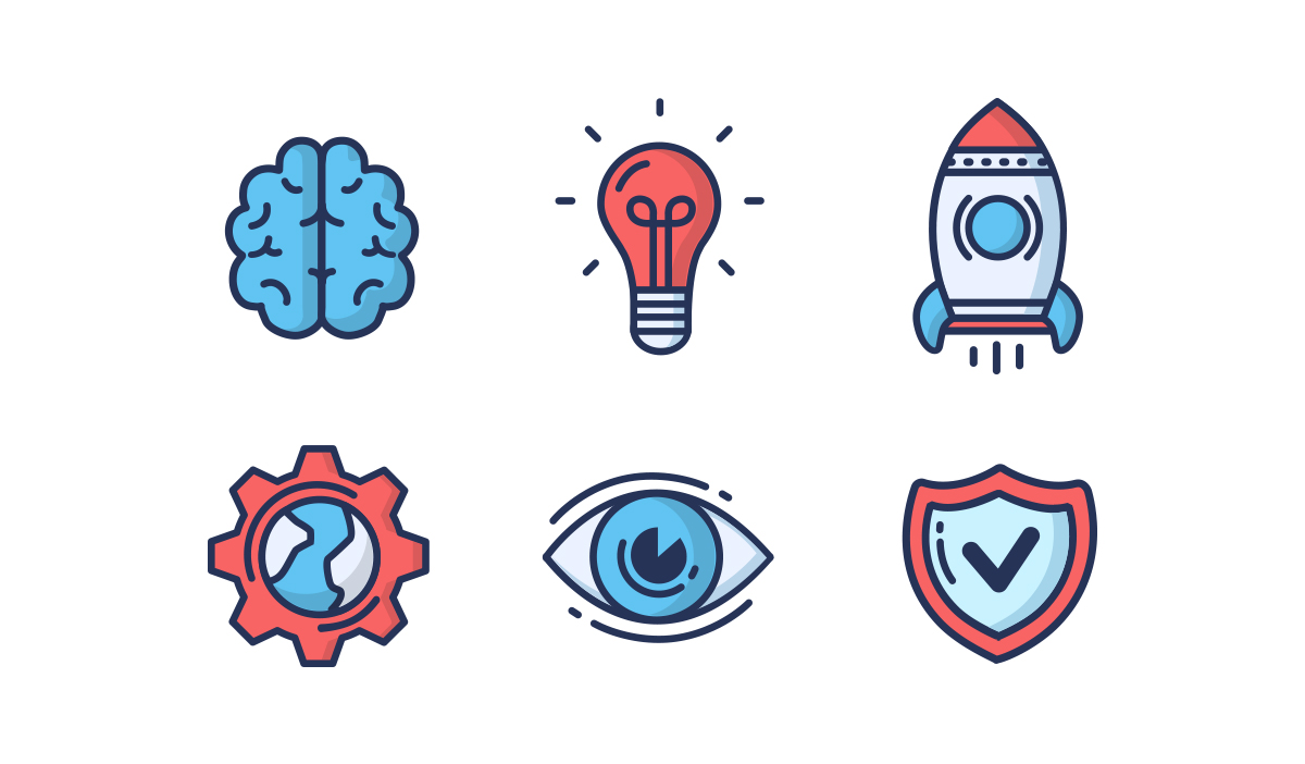
- smart technology & innovation.
As a result, our kit turned out to include almost 300 icons.
Since we have published Liconica, there have been lots of requests from our customers to create additional icons in this style, and we were delighted to help. Also, some of them use them as highlight icons on their social media. And it’s always a pleasure seeing them in action.
Liconica as many of our families has a black-and-white twin for those who prefer monochrome.
You can see now that all our icon families, even such small ones as Liconica, have their own individuality, features, themes, and story.